


In this variation, we were tasked with only using one typeface and type size. There was also no use of any use of bar lines.

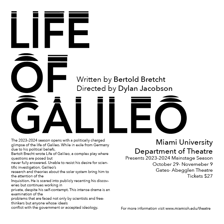
In this variation, I was still limited in my use of type size and typeface, however I was able to bolden words for typographical emphasis.
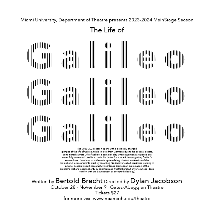
In this version, I was able to have more choice in type size as well as using bars. I decided to use the bars in an unorthodox way, to make the word "Galileo" much bigger. Using this method, I was also able to achieve a larger value range.
In this version, I wanted to focus establishing a grid. Since I could not use any color in this poster, it was important that I found a way to still achieve contrast and establish a hierarchy of information.
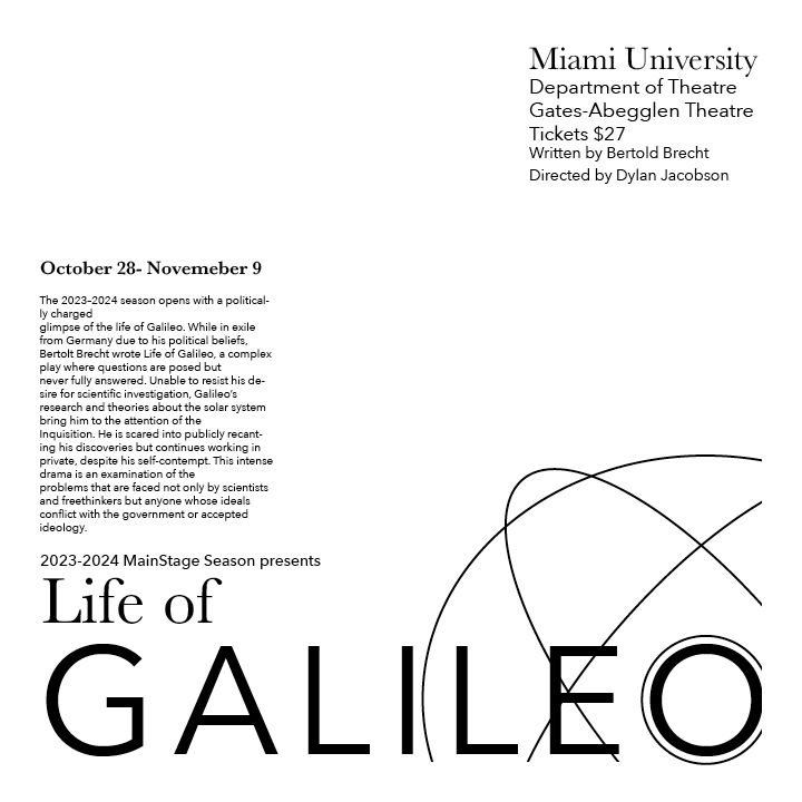
In this version, I focused on using lines to create a more subjective visual element that had to do with the actual story. The lines encapsulating the "O" of Galileo were meant to create one of Galileo's tools that he used called the Armillary Sphere.
This project was completed in my Typography class. This was a particularly challenging yet rewarding project to complete. The information on all of these variations is the same, yet each variation is distinctly different. Before I reached my final designs, I went through multiple rounds of variations that I felt weren't achieving what I wanted. This project really challenged me to dig deeper into the creative process and look closely at what I thought what was working in a design and what wasn't.


